How to Add a Theme Selector to Your Next.js App
8 mins read
Introduction
I love customizing my software and setup, whether it’s my terminal, editor, or even my web apps. If you’ve read my previous blog post about managing my dotfiles (I use Arch, btw), you know how much I enjoy tailoring my environment to fit my preferences.
Shadcn makes styling incredibly easy with its standard approach, allowing you to customize your UI while keeping things clean and maintainable. One of my projects, hookcn, has a theme selector implemented using a different approach than what we’ll be exploring today (someday, I’ll get around to updating it).
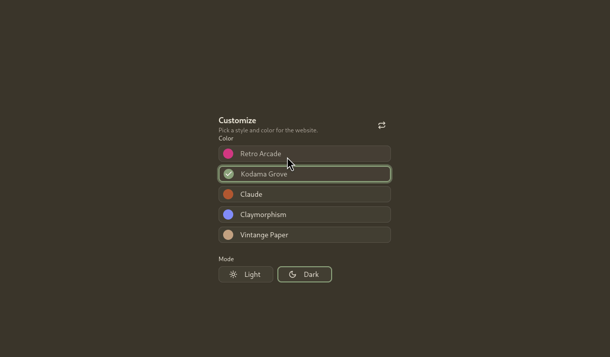
Demo
Steps to Implement the Theme Selector
Before we dive in, let’s set some assumptions:
-
You already have a Next.js app configured with shadcn.
-
We will be using Tailwind CSS v4 with oklch color values.
Step 1: Collecting and Organizing Themes
First, you’ll need to decide on the themes you want to use in your app. There are several tools that can help you generate or find shadcn-compatible themes, such as:
- tweakcn – A powerful tool to tweak and generate shadcn themes.
- ZippyStarter’s shadcn/ui Theme Generator – Another great option for generating themes quickly.
Once you’ve chosen your themes, create a separate CSS file to store them. In your project, create a file named themes.css and define your themes like this:
.theme-kodama-grove {28 collapsed lines  --background: oklch(0.88 0.05 91.79);  --foreground: oklch(0.43 0.03 59.22);
  --card: oklch(0.89 0.04 87.57);  --card-foreground: oklch(0.43 0.03 59.22);
  --popover: oklch(0.94 0.03 89.85);  --popover-foreground: oklch(0.43 0.03 59.22);
  --primary: oklch(0.67 0.11 118.91);  --primary-foreground: oklch(0.99 0.01 88.64);
  --secondary: oklch(0.85 0.06 91.15);  --secondary-foreground: oklch(0.43 0.03 59.22);
  --muted: oklch(0.85 0.06 91.15);  --muted-foreground: oklch(0.58 0.03 60.93);
  --accent: oklch(0.84 0.07 90.33);  --accent-foreground: oklch(0.43 0.03 59.22);
  --destructive: oklch(0.71 0.1 29.98);  --destructive-foreground: oklch(0.98 0.01 91.48);
  --border: oklch(0.69 0.04 59.84);  --input: oklch(0.84 0.07 90.33);
  --ring: oklch(0.73 0.06 130.85);  @variant dark {27 collapsed lines    --background: oklch(0.33 0.02 88.07);    --foreground: oklch(0.92 0.02 82.12);
    --card: oklch(0.36 0.02 82.33);    --card-foreground: oklch(0.92 0.02 82.12);
    --popover: oklch(0.36 0.02 82.33);    --popover-foreground: oklch(0.92 0.02 82.12);
    --primary: oklch(0.68 0.06 132.45);    --primary-foreground: oklch(0.27 0.01 61.02);
    --secondary: oklch(0.44 0.02 84.55);    --secondary-foreground: oklch(0.92 0.02 82.12);
    --muted: oklch(0.39 0.02 82.71);    --muted-foreground: oklch(0.71 0.02 73.62);
    --accent: oklch(0.65 0.07 90.76);    --accent-foreground: oklch(0.27 0.01 61.02);
    --destructive: oklch(0.63 0.08 31.3);    --destructive-foreground: oklch(0.94 0.02 84.59);
    --border: oklch(0.44 0.02 84.55);    --input: oklch(0.44 0.02 84.55);    --ring: oklch(0.68 0.06 132.45);  }}
.theme-claude {28 collapsed lines  --background: oklch(0.96 0.01 100.82);  --foreground: oklch(0.34 0.03 95.72);
  --card: oklch(0.92 0.02 90.55);  --card-foreground: oklch(0.34 0.03 95.72);
  --popover: oklch(0.92 0.02 99.61);  --popover-foreground: oklch(0.27 0.02 98.94);
  --primary: oklch(0.56 0.13 43);  --primary-foreground: oklch(1 0 0);
  --secondary: oklch(0.85 0.05 298.88);  --secondary-foreground: oklch(0.43 0.02 98.6);
  --muted: oklch(0.93 0.02 90.24);  --muted-foreground: oklch(0.5 0.02 98.53);
  --accent: oklch(0.88 0.03 93.13);  --accent-foreground: oklch(0.27 0.02 98.94);
  --destructive: oklch(0.64 0.21 25.33);  --destructive-foreground: oklch(1 0 0);
  --border: oklch(0.86 0.01 97.47);  --input: oklch(0.76 0.02 98.35);  --ring: oklch(0.59 0.17 253.06);
  @variant dark {27 collapsed lines    --background: oklch(0.29 0.01 106.73);    --foreground: oklch(0.92 0 106.48);
    --card: oklch(0.25 0.01 91.6);    --card-foreground: oklch(0.92 0 106.48);
    --popover: oklch(0.24 0.01 95.37);    --popover-foreground: oklch(0.92 0 106.48);
    --primary: oklch(0.56 0.13 43);    --primary-foreground: oklch(1 0 0);
    --secondary: oklch(0.28 0.05 290.5);    --secondary-foreground: oklch(0.84 0.01 93.59);
    --muted: oklch(0.27 0.01 91.58);    --muted-foreground: oklch(0.77 0.02 99.07);
    --accent: oklch(0.21 0.01 95.42);    --accent-foreground: oklch(0.97 0.01 98.88);
    --destructive: oklch(0.64 0.21 25.33);    --destructive-foreground: oklch(1 0 0);
    --border: oklch(0.36 0.01 106.89);    --input: oklch(0.43 0.01 100.22);    --ring: oklch(0.59 0.17 253.06);  }}
// other themes
Step 2: Importing Themes into globals.css
Now that you have your themes.css file ready, you need to import it into your global styles. Open your globals.css file and add the following line:
@import "tailwindcss";@import "tw-animate-css";
@custom-variant dark (&:is(.dark *));
@import "./themes.css";
// ...
Step 3: Creating the ActiveThemeProvider Component
Next, we’ll create a new component to manage the active theme context. Create a file named active-theme.tsx and add the following code:
"use client"
import {  ReactNode,  createContext,  useContext,  useEffect,  useState,} from "react"
const COOKIE_NAME = "active_theme"const DEFAULT_THEME = "default"
function setThemeCookie(theme: string) {  if (typeof window === "undefined") return
  document.cookie = `${COOKIE_NAME}=${theme}; path=/; max-age=31536000; SameSite=Lax; ${window.location.protocol === "https:" ? "Secure;" : ""}`}
type ThemeContextType = {  activeTheme: string  setActiveTheme: (theme: string) => void}
const ThemeContext = createContext<ThemeContextType | undefined>(undefined)
export function ActiveThemeProvider({  children,  initialTheme,}: {  children: ReactNode  initialTheme?: string}) {  const [activeTheme, setActiveTheme] = useState<string>(    () => initialTheme || DEFAULT_THEME,  )
  useEffect(() => {    setThemeCookie(activeTheme)
    Array.from(document.body.classList)      .filter((className) => className.startsWith("theme-"))      .forEach((className) => {        document.body.classList.remove(className)      })    document.body.classList.add(`theme-${activeTheme}`)    if (activeTheme.endsWith("-scaled")) {      document.body.classList.add("theme-scaled")    }  }, [activeTheme])
  return (    <ThemeContext.Provider value={{ activeTheme, setActiveTheme }}>      {children}    </ThemeContext.Provider>  )}
export function useThemeConfig() {  const context = useContext(ThemeContext)  if (context === undefined) {    throw new Error("useThemeConfig must be used within an ActiveThemeProvider")  }  return context}
This component creates a React context to store the active theme, sets a cookie to persist it, and updates the class list on the body element accordingly. This will allow the theme to persist across page reloads.
Step 4: Updating layout.tsx to Include the ActiveThemeProvider
Now that we have our theme provider, we need to update our layout.tsx file to include it:
import type { Metadata } from "next"import { ThemeProvider } from "next-themes"import { Geist, Geist_Mono } from "next/font/google"import { cookies } from "next/headers"
import "./globals.css"
import { ActiveThemeProvider } from "@/components/active-theme"17 collapsed lines
import { cn } from "@/lib/utils"
const geistSans = Geist({ variable: "--font-geist-sans", subsets: ["latin"],})
const geistMono = Geist_Mono({ variable: "--font-geist-mono", subsets: ["latin"],})
export const metadata: Metadata = { title: "Create Next App", description: "Generated by create next app",}
export default async function RootLayout({ children,}: Readonly<{ children: React.ReactNode}>) { const cookieStore = await cookies() const activeThemeValue = cookieStore.get("active_theme")?.value return ( <html lang="en" suppressHydrationWarning> <body className={cn( geistSans.variable, geistMono.variable, "antialiased", activeThemeValue ? `theme-${activeThemeValue}` : "", )} > <ThemeProvider attribute="class" disableTransitionOnChange> <ActiveThemeProvider initialTheme={activeThemeValue}> {children} </ActiveThemeProvider> </ThemeProvider> </body> </html> )}Step 5: Creating the Theme Selector Component
To allow users to switch themes, we’ll create a theme selector component. This requires two files:
- A utility file (
lib/colors.ts) that lists the available themes. - A React component (
components/theme-selector.tsx) that displays the theme options and lets users select one.
First, create a new file lib/colors.ts and define your themes like this:
export const baseColors = [  {    name: "retro-arcade",    label: "Retro Arcade",    activeColor: {      light: "oklch(0.59 0.2 355.89)",      dark: "oklch(0.59 0.2 355.89)",    },  },  {    name: "kodama-grove",    label: "Kodama Grove",    activeColor: {      light: "oklch(0.67 0.11 118.91)",      dark: "oklch(0.68 0.06 132.45)",    },  },  {    name: "claude",    label: "Claude",    activeColor: {      light: "oklch(0.56 0.13 43.00)",      dark: "oklch(0.56 0.13 43.00)",    },  },  {    name: "claymorphism",    label: "Claymorphism",    activeColor: {      light: "oklch(0.59 0.2 277.12)",      dark: "oklch(0.68 0.16 276.93)",    },  },  {    name: "vintage-paper",    label: "Vintage Paper",    activeColor: {      light: "oklch(0.62 0.08 65.54)",      dark: "oklch(0.73 0.06 66.7)",    },  },] as const
export type BaseColor = (typeof baseColors)[number]
Now that we have our themes defined, let’s build the ThemeSelector component. This will allow users to switch between different color themes and light/dark modes.
Create a new file components/theme-selector.tsx and add the following code:
"use client"import { CheckIcon, MoonIcon, RepeatIcon, SunIcon } from "lucide-react"import { useTheme } from "next-themes"import * as React from "react"
import { useThemeConfig } from "@/components/active-theme"import { Button } from "@/components/ui/button"import { Label } from "@/components/ui/label"import { Skeleton } from "@/components/ui/skeleton"import { baseColors } from "@/lib/colors"import { cn } from "@/lib/utils"
export function ThemeSelector() {  const { activeTheme, setActiveTheme } = useThemeConfig()  const [mounted, setMounted] = React.useState(false)  const { setTheme, resolvedTheme: theme } = useTheme()
  React.useEffect(() => {    setMounted(true)  }, [])
  return (    <div className="w-full">      <div className="flex items-start pt-4 md:pt-0">        <div className="space-y-1 pr-2">          <div className="leading-none font-semibold tracking-tight">            Customize          </div>          <div className="text-muted-foreground text-xs">            Pick a style and color for the website.          </div>        </div>        <Button          variant="ghost"          size="icon"          className="ml-auto rounded-[0.5rem]"          onClick={() => setTheme("system")}        >          <RepeatIcon />          <span className="sr-only">Reset</span>        </Button>      </div>      <div className="flex flex-1 flex-col space-y-4 md:space-y-6">        <div className="space-y-1.5">          <Label className="text-xs">Color</Label>          <div className="flex flex-col gap-2">            {baseColors.map((color) => {              const isActive = activeTheme === color.name
              return mounted ? (                <Button                  variant={"outline"}                  size="sm"                  key={color.name}                  onClick={() => {                    setActiveTheme(color.name)                  }}                  className={cn(                    "justify-start",                    isActive && "border-primary dark:border-primary border-2",                  )}                  style={                    {                      "--theme-primary": `${                        color?.activeColor[theme === "dark" ? "dark" : "light"]                      }`,                    } as React.CSSProperties                  }                >                  <span                    className={cn(                      "mr-1 flex size-5 shrink-0 -translate-x-1 items-center justify-center rounded-full bg-[var(--theme-primary)]",                    )}                  >                    {isActive && <CheckIcon className="size-4 text-white" />}                  </span>                  {color.label}                </Button>              ) : (                <Skeleton className="h-8 w-full" key={color.name} />              )            })}          </div>        </div>        <div className="space-y-1.5">          <Label className="text-xs">Mode</Label>          <div className="grid grid-cols-3 gap-2">            {mounted ? (              <>                <Button                  variant={"outline"}                  size="sm"                  onClick={() => setTheme(theme === "dark" ? "light" : "dark")}                  className={cn(theme !== "dark" && "border-primary border-2")}                >                  <SunIcon className="mr-1 -translate-x-1" />                  Light                </Button>                <Button                  variant={"outline"}                  size="sm"                  onClick={() => setTheme(theme === "light" ? "dark" : "light")}                  className={cn(                    theme === "dark" &&                      "border-primary dark:border-primary border-2",                  )}                >                  <MoonIcon className="mr-1 -translate-x-1" />                  Dark                </Button>              </>            ) : (              <>                <Skeleton className="h-8 w-full" />                <Skeleton className="h-8 w-full" />              </>            )}          </div>        </div>      </div>    </div>  )}
Conclusion
Thanks for reading this far! I hope this was beneficial. Don’t forget to check out the example repository for the full implementation.
And voilà! 👨🍳 Now your app can have an infinite amount of themes. Enjoy! 🎨🚀